They’re the heart of a home, the first place a buyer will check out and a room that needs to blend high-end luxury with wholesome comfort… there’s just no overstating the importance of a kitchen!
And to make their homes stand out, The Blockheads are pulling out all stops with their Kitchen and Laundry spaces.
You are watching: The Block 2023: Kitchen and Laundry Reveal
From innovative technology to simple good planning, the teams are throwing everything they can think of into this week to make sure they win the judges over.
But who takes out the win will be one of the biggest surprises of the season!
Eliza and Liberty
First place
Cash Spent – $23,669
From the “beautifully brave” orange oven to a perfectly-proportioned island bench looking out to the pool and living room, a built-in bar and appliances all where they should be, this was a kitchen that ticked all the boxes for a high-end family home.
“I’m looking around and literally not left wanting for anything!” Darren said as he took it all in.
Even the artwork was perfect, Neale noted, accentuating the bold oven choice.
Accompanied by a serviceable butlers pantry and adjacent to a laundry that had a huge linen cupboard alongside the top-of-the-line machines, this was a zone that well and truly lives up the title: “the heart of the home”.
“We have been crying out for functionality all day,” Shaynna summed up, “and here it is in spades.”
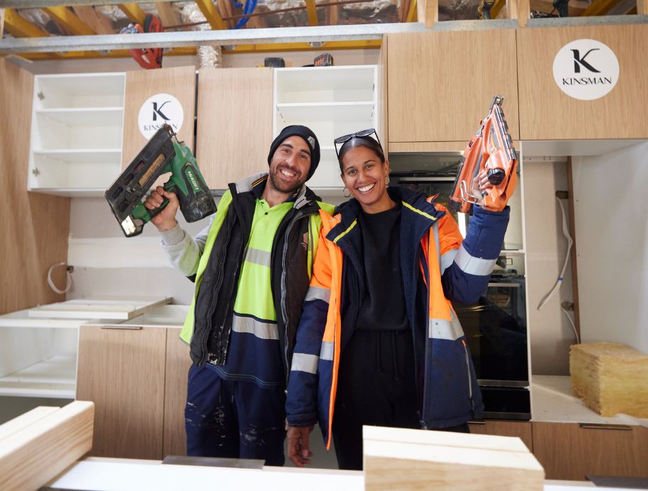
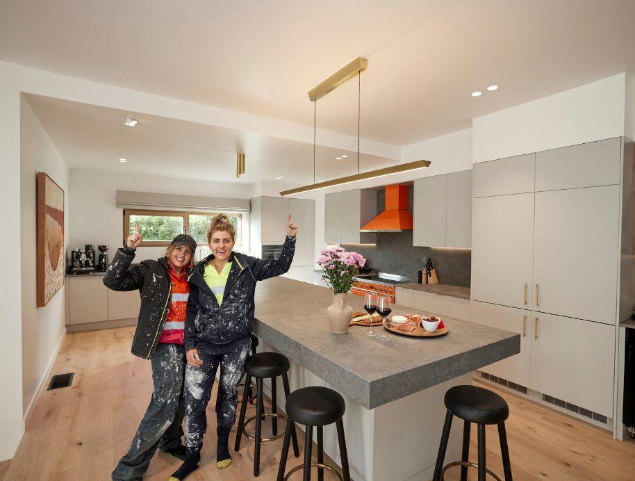 YEAH THE GIRLS! No conspiricy theories here, just hard work paying off for Liberty and Eliza and securing a much needed win! And with the help of Kinsman kitchens they delivered.
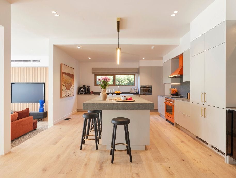 Complete with a 4 metre Consentino benchtop, bright orange Smeg oven, this kitchen really is the heart of house 5’s home!
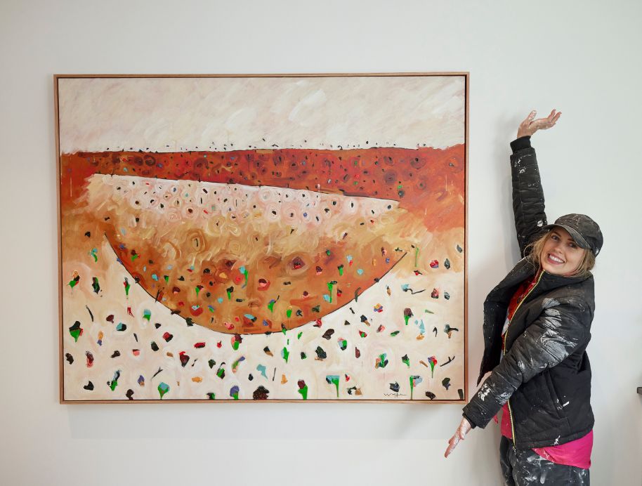 Gorgeous artwork and it’s the one focal point, it work’s with the orange, just beautiful! said Neale and we couldn’t agree more, Michael Wolfe has appeared on the Block before and was also an artist in residence at Gisborne in 2022, he always creates spectacular artwork.
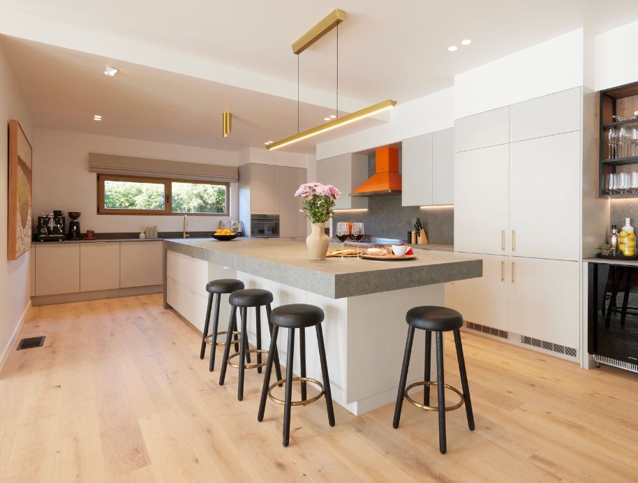 Eliza and Liberty pulled out their secret gnome this week and boy did it set the cat amoungst the pigeons, but with a 10 from Shaynna it really didn’t matter.
 We all know Shaynna is all about the storage “and this has it in spades” she said. The kitchen lead to the butlers pantry which lead to the laundry, which to the judges delight lead to the linen cupboard…. oh and the laundry has a door to outside, tick tick tick!!
 The girls really thought of every little detail on the biggest kitchen on The Block, well done! It’s a $20k payday for the girls!
Kristy and Brett
Second place
Cash Spent – $29,878
Immediately taken with the huge Cosentino Rosso Porto stone bench set against crisp white cabinetry, a remote-controlled storage splashback, state-of-the-art appliances the judges agreed when Shaynna stopped smiling long enough to declare: “Kristy and Brett have nailed it!”.
Looking closer they were wowed by the wine fridge, the Hafele “rise and fall” remote-controlled splashback and the generous butler’s pantry, perfect for a house this size.
In the laundry, Neale immediately fell for the built-in dog bed, but wondered if it came at the expense of more benchtop space.
Read more : What’s the Best Flooring for Uneven Floor Surfaces
But that was only a small problem, they said in what was overall a great space that would have buyers imagining their life there.
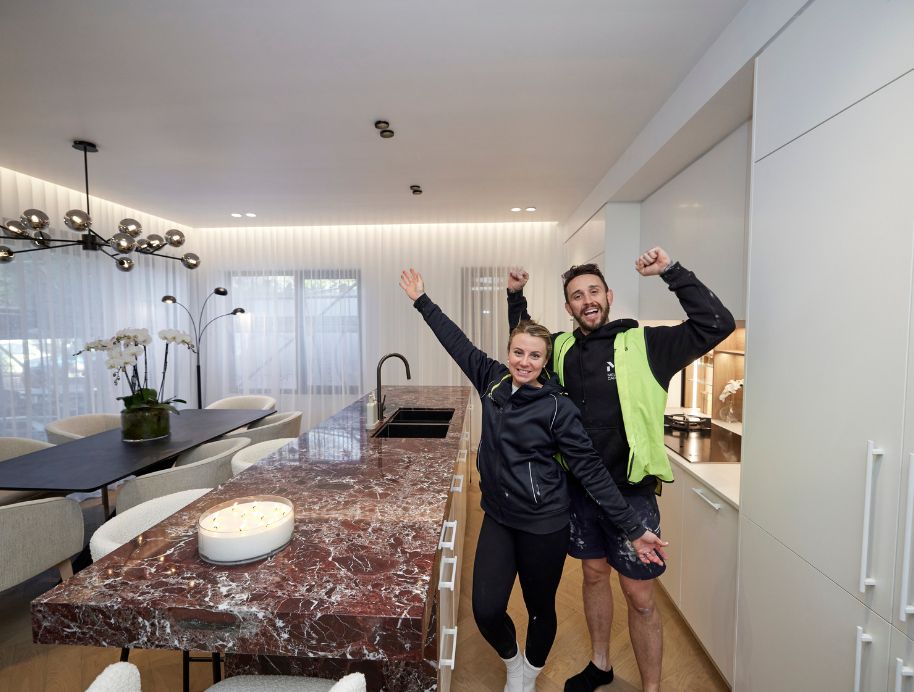 Kristy and Brett wowed the judges with their show stopping kitchen this week.
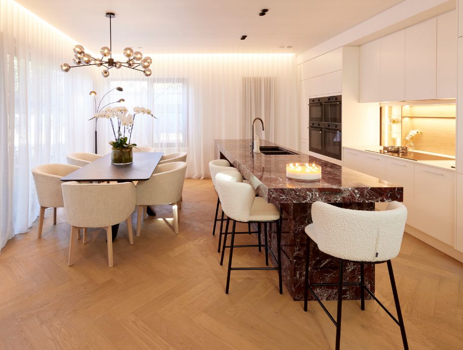 Nadia from The Block Shop saved the day delivering these Boucle stools at 8:30 sunday morning! Bordeaux candle also from The Block Shop, and let me tell you it smells divine! Shop the full range here.
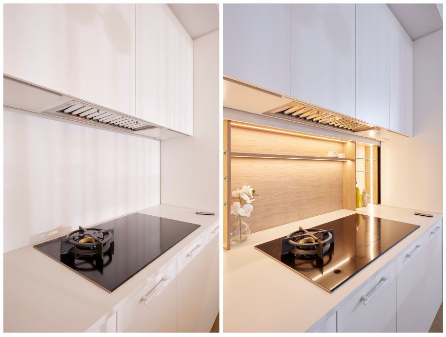 Darren excitedly showed the other judges Kristy and Brett’s wow factor, the Hafele rise and fall splashback, now you see it now you don’t!
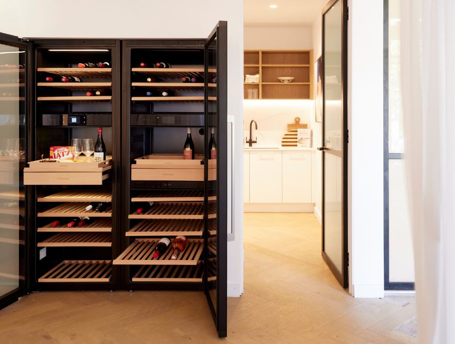
And lets not forget the wine fridge, the ultimate luxury piece for entertaining!
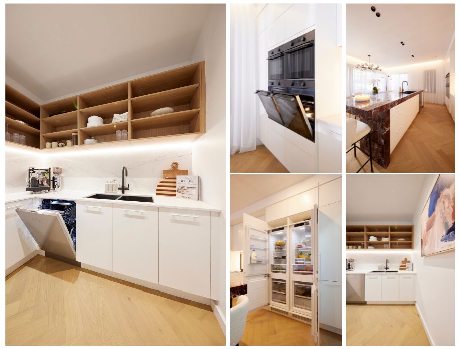 Kristy and Brett filled the kitchen with luxury applances with a dishwasher in the butlers, four ovens, and some beautiful styling including artwork from Urban Rd and nesting bowls from Styleware that we are obsessed with here! but good luck choosing from the beautiful colour choices!
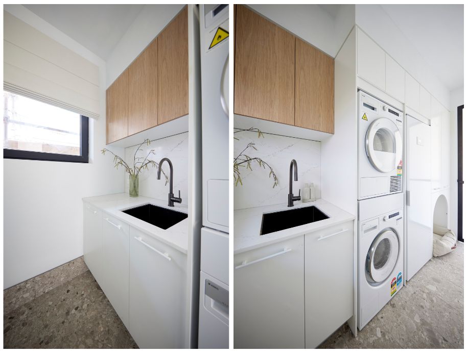 Neale immediately fell for the built-in dog bed, but wondered if it came at the expense of more benchtop space.
Kyle and Leslie
Third place
Cash Spent – $33,750
The “House of Curves” delivered again this week with the judges immediately impressed by what they saw.
“Very on trend” they said of the soft edges in the kitchen, with Neale in particular captivated by the Kimilya White artwork and Travertine-look Dekton topped island.
Darren pointed out it was a beautiful space to look at from adjacent dining and living areas and layout wise, they all agreed everything was spot on, with the high-end appliance all in the right place for ease of use and access.
Neale commented on the stunning velux skylights saying he had “never seen them used this way, STUNNING!’
The butler’s pantry gave them pause, could the space have been access to the pool, they wondered, but the laundry won them back, with two-points of access, Hafele sink and high end appliances including an LG Clothing Care system in pride of place.
 The “House of Curves” delivered again this week with the judges immediately impressed by what they saw. Kinsman Kitchens nail the brief again!
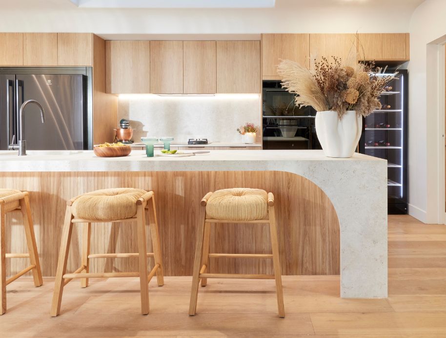
Leslie cleverly mastering the minimalist look while adding touches of green to match the beautiful artwork. We could definately sip on those margaritas in this space! and because we know you will ask here are those beautiful margarita glasses.
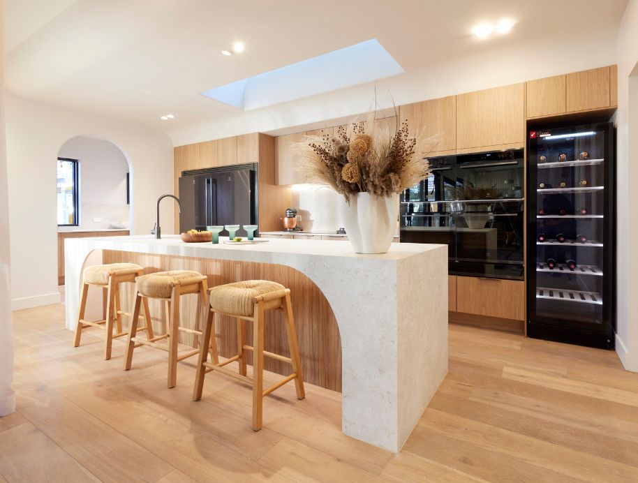 Neale commented on the stunning velux skylights saying he had “never seen them used this way, STUNNING!’
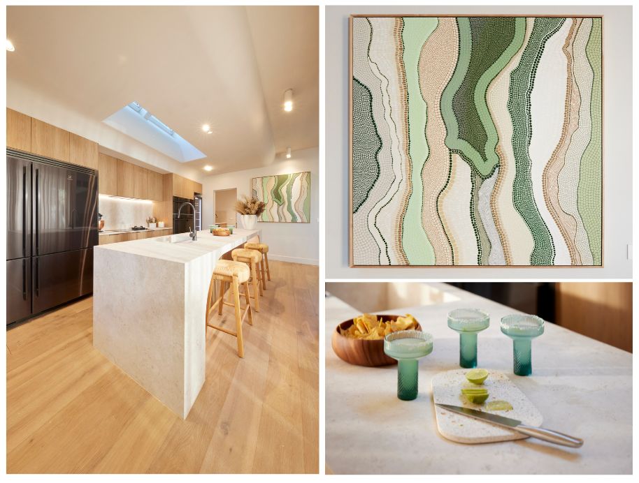 “Very on trend” they said of the soft edges in the kitchen, with Neale in particular captivated by the Kimilya White artwork and Travertine-look Dekton topped island.
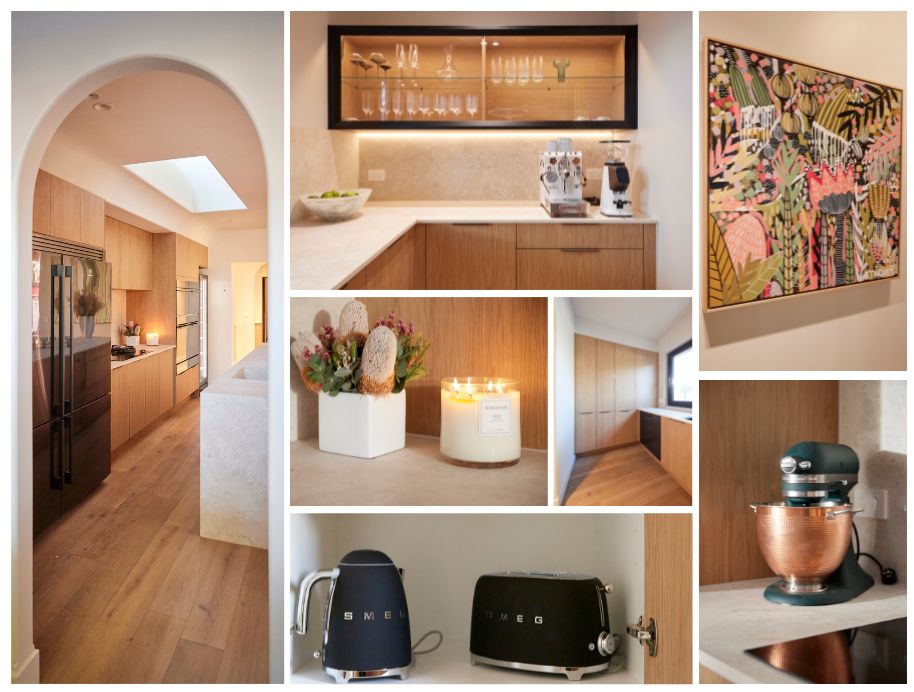
The judges thought the butlers pantry should have been repositioned so the kitchen had direct access to the back yard, even the butlers had beautiful art by B.Twomey, high end appliances, and another beautiful Bordeaux Candle.
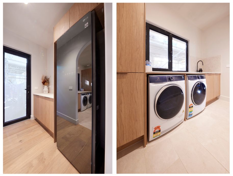 The laundry pleased the judges and their need for bench space!
Leah and Ash
Read more : How To Replace A Bathroom Tap
Fourth place
Cash Spent – $22,083
From the tiles under the Sensa quartzite stone island to gold metallic laminate, dark-timber-look joinery, high-end appliances including a custom hot pink coffee machine and more, this was a kitchen that sat perfectly with the eclectic living-dining room, the judges agreed.
“Besotted!” Darren said as he took it all in. The only flaw, he said, was the size of the island bench, too small for a house of this stature.
So too was the butler’s pantry, Neale suggested, leaving them wondering about the layout plan.
Into the laundry through the bathroom – something Neale wasn’t sure about at all – the luxe fittings wowed, but once again it was size that caught them short. Literally. A gamble that just didn’t pay off, Shaynna said.
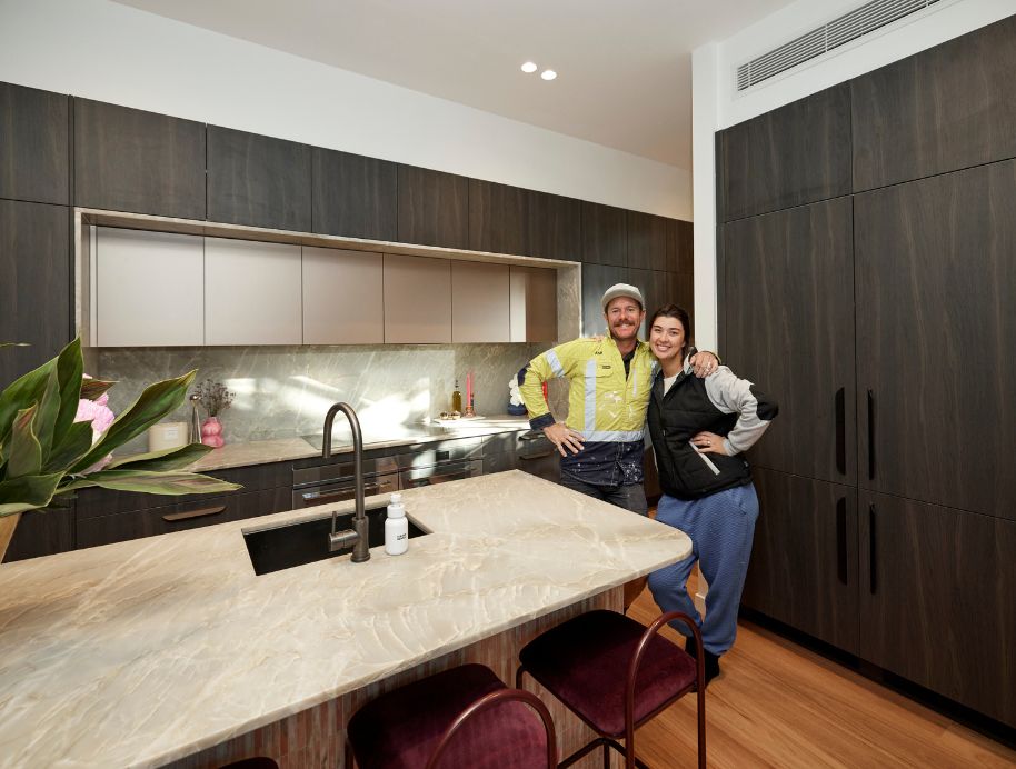 The judges were pleased to see Leah and Ash created a kitchen that sat perfectly with the eclectic living-dining room, the judges agreed.
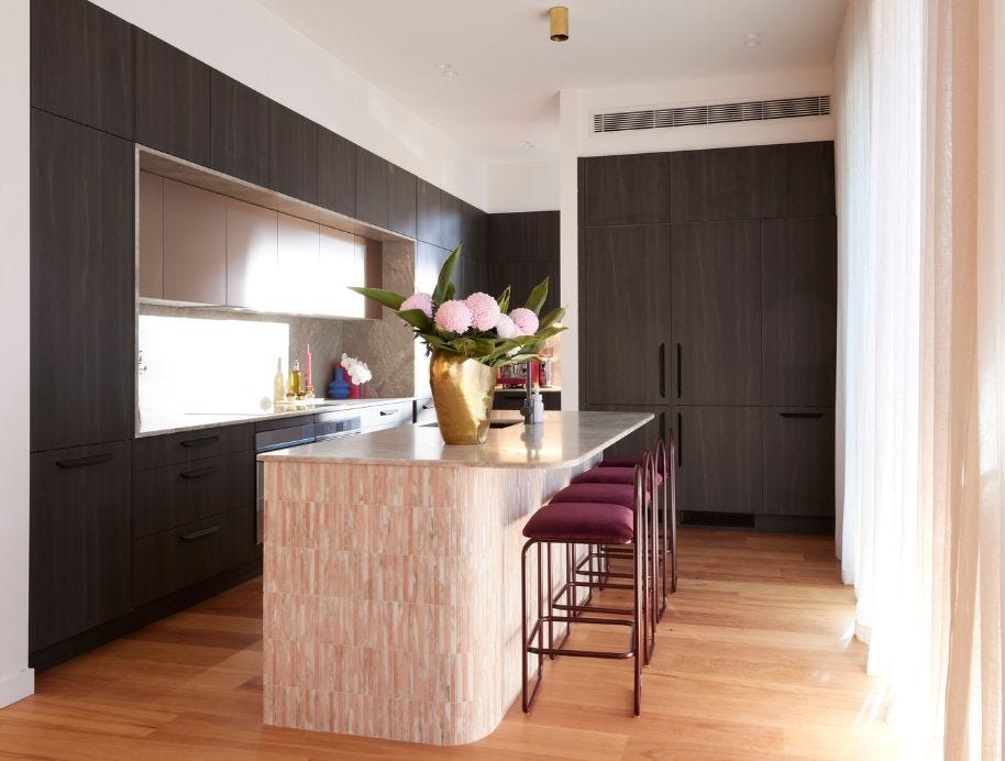 The judges said the size of the island bench, was too small for a house of this stature.
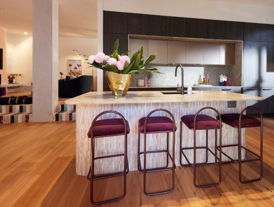 For the dark and moody fans out there check out this Kinsman Kitchen design the colours are just a dream!
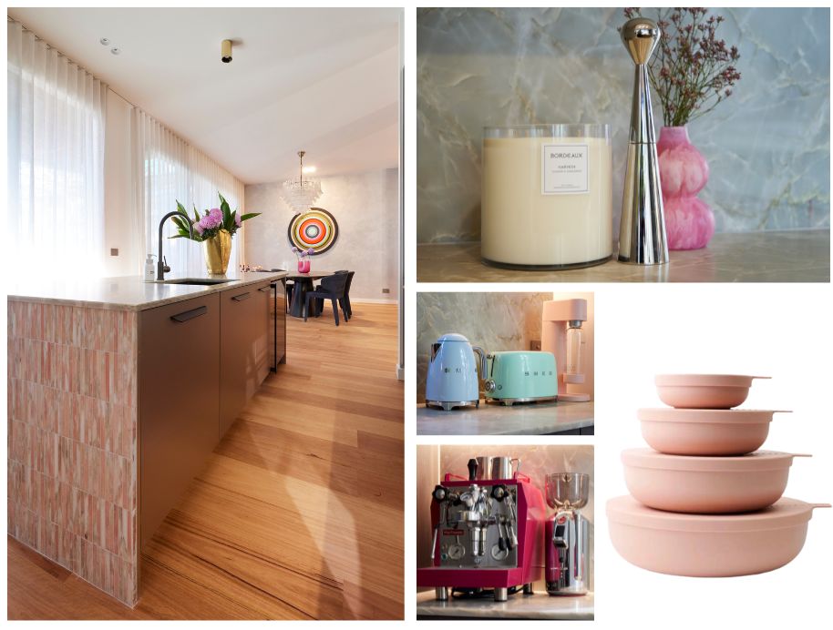 Pink was definately the colour of the day for Leah and Ash, and it is nice to see some colour being used. We were pleased to see the Blush Styleware nesting bowls in House 2.
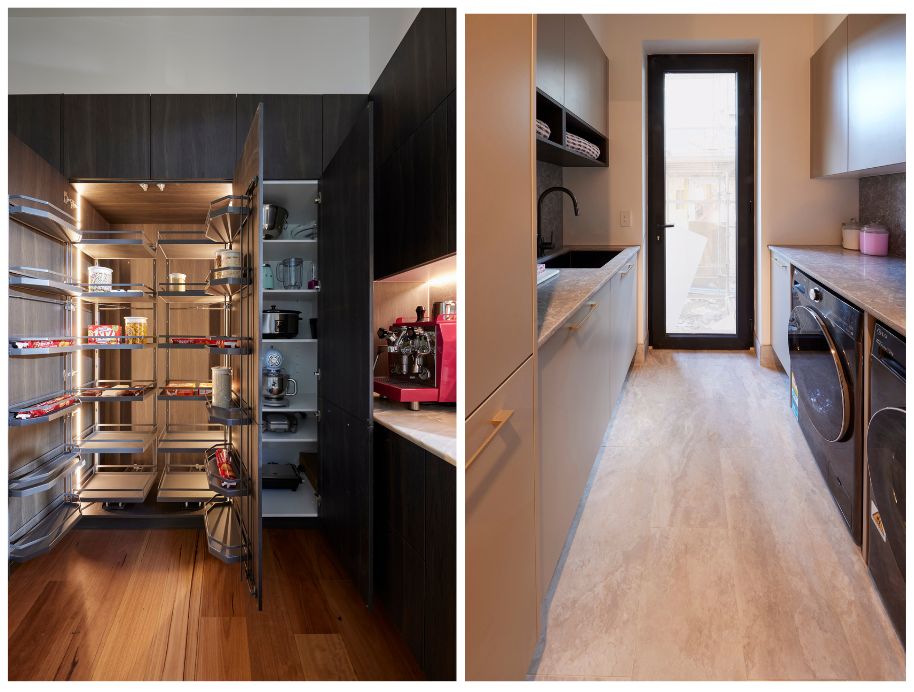 The judge’s believed the butler’s pantry took away valuable real estate from the kitchen and access to the laundry via the bathroom didn’t winover the judges either, questioning the couples floorplan choice, “A gamble that just didn’t pay off”, Shaynna said.
Steph and Gian
Fifth place
Cash Spent – $25,304
After taking a gamble with moving their kitchen from its original place in the plans, the judges were forced to admit Steph and Gian’s new position worked well, creating an island perfect for sitting around… but was the layout better this way?
With the cooktop in the island, anyone sitting there would have to be careful, Shaynna pointed out and having the usual kitchen zones separated – some into the adjacent butlers – Darren asked if perhaps they should have stuck with the original architect’s idea.
It was a beautiful kitchen, Neale said, but one designed by an architect, not a cook. That was a criticism that carried through to the butlers pantry and the laundry, all great to look at, but as Neale said: “Beautifully dysfunctional”.
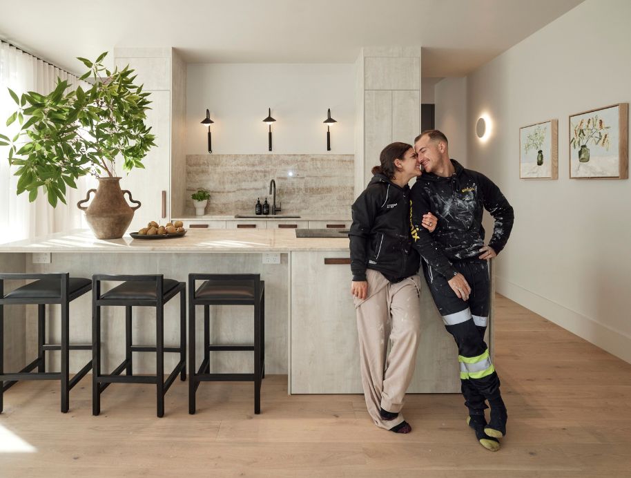 Steph and Gian were criticised by the judges for a “Beautifully dysfunctional” kitchen, but I have to tell you, for a kitchen that come fifth I struggled not to pick every picture for this blog, asthetically this kitchen is beautiful! My practical hat has fallen off.
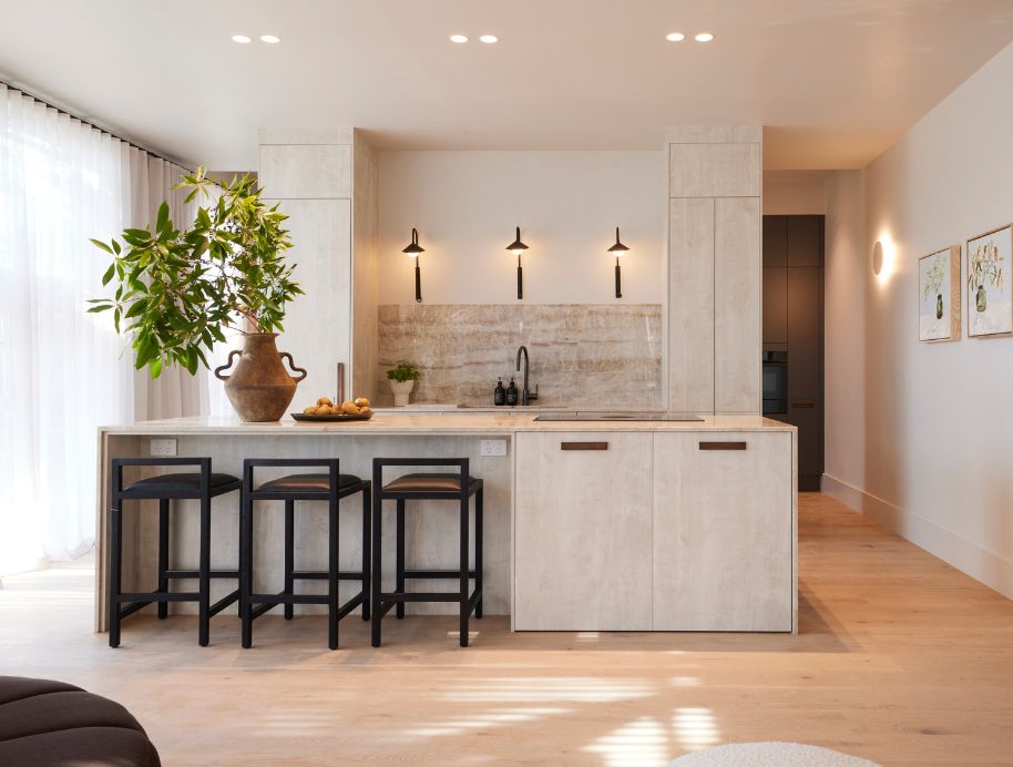 Continuing with their minimalist, Japandi asthetic, the couple opted for beautiful Michelle Keighley artwork, classic Satara Stools and custom Beacon lighting in place of a rangehood.
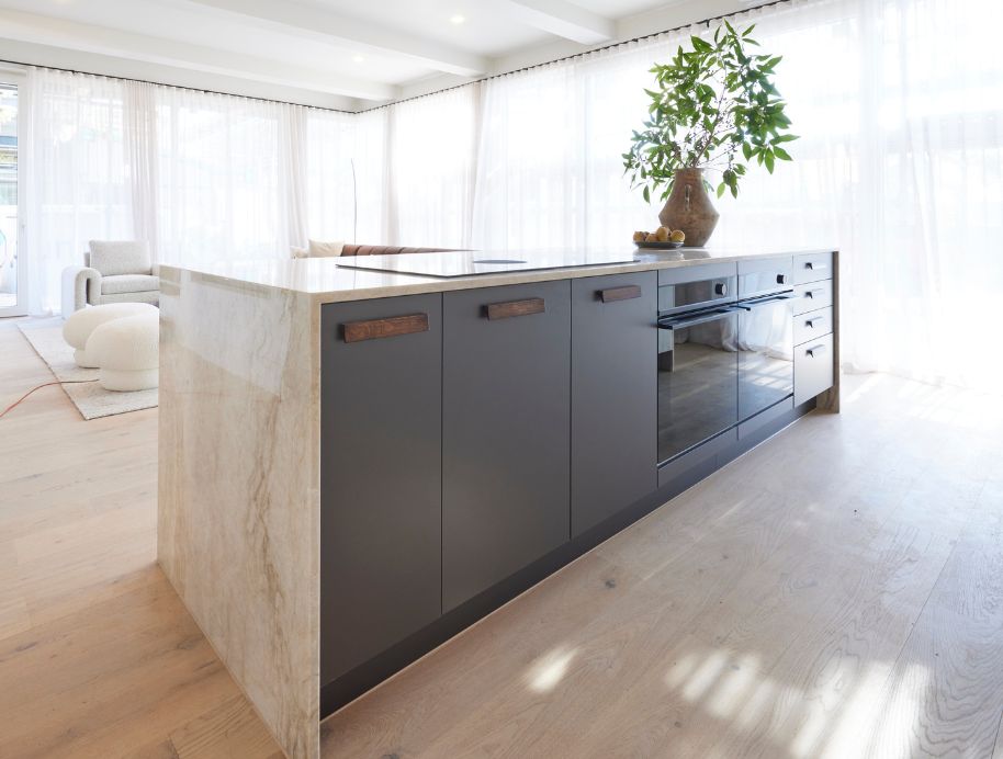 We have been ooh-ing and arg-ing all week at the Kinsman Kitchens in these houses, they literally don’t stop in Kitchen week and we are always amazed by their new designs! It really is a family here and Kinsman are our favourite aunties.
 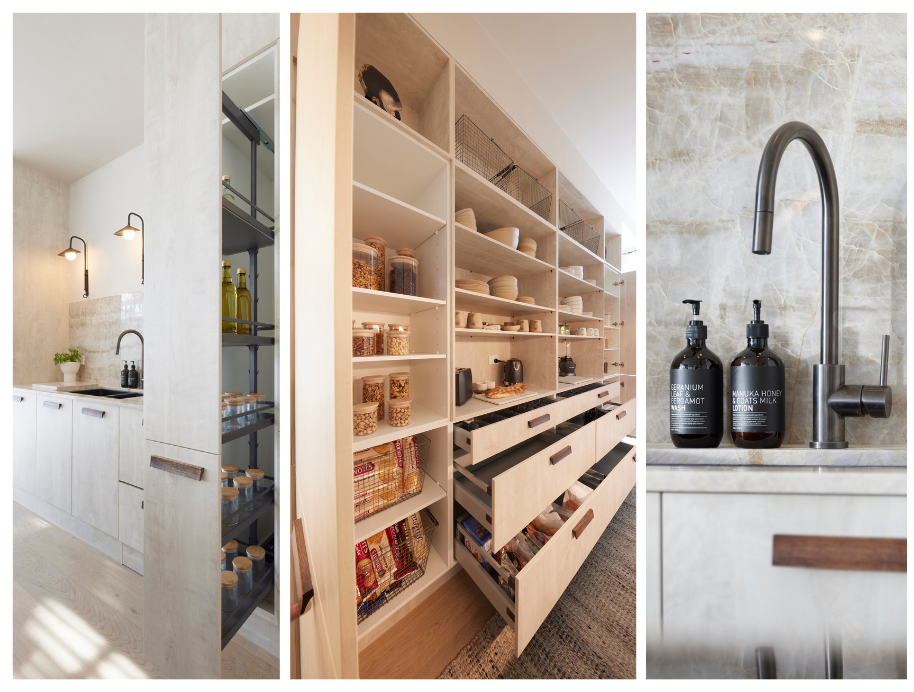 With ample storage in the butlers pantry the judges were concerned there wasn’t enough in the kitchen.
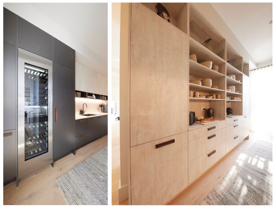 In usual Steph style the butlers and wine fridges were styled perfectly in muted tones.
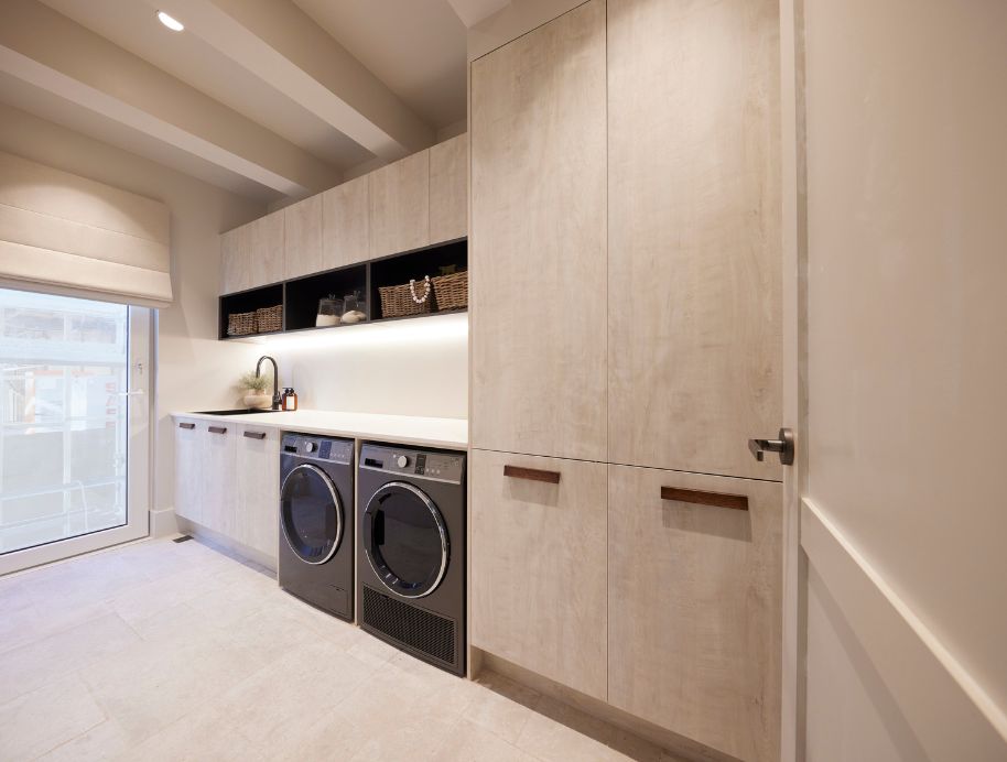
The laundry matched the rest of the house’s asthetic perfectly and delivered on bench space so the judges were happy!
Are you team Minimalist like House 1, Psycho Deco like House 2 or Japandi in House 4? Take the quiz to see which Block couple you are here.

Source: https://gardencourte.com
Categories: Kitchens

